Friday 18 October 2013

Survey to Research Community Space Development in Baldock: (Teens Only)


How old are you?


 0-10


 11-15


 16-20


How long have you lived in Baldock?


 0-5 years


 6-10 years


 10+


What public places in Baldock do you normally ‘hang out’ in?

[ ]

Do you feel intimidated in Baldock?

 Yes

 No

 I don’t know

Do you think Baldock would benefit from new facilities such as a youth club?

 Yes

 No

 I don’t know

Would you go to a youth club if it was available?

 Yes

 No

 I don’t know

What services would you like to be provided for fun?

[ ]


What services would you like to be provided for serious issues?
[ ]

Our Presentation


Our first presentation was to inform 'Regeneration' about out initial research ideas for our campaign.

Our presentation:


Our prezi presentation
 
---
Survey- Target audience
Our second survey was aimed directly at our target audience which we decided would be teenagers. We thought teenagers would be the best target audience as we are all teenagers ourselves so can easily relate to what they want and what they need. It also means that the we will be most suited to using appropriate language and methods of promotion that we know teenagers will see.
In this survey we asked more direct questions about where people 'hung out' and spent their free time. We also asked whether they felt Baldock would benefit from having a youth club that wasn't strictly Christian and whether they would attended the youth club.

(Copy of teen survey)


  • We also found that the places most of the teenagers 'hung out' in were 'Costa', the park and Tesco.
  • We also found out that the services the teenagers we surveyed would like to be provided for fun, included more places to sit down with friends in town, and at the park; more shops; small cinema screenings and a couple of people wanted a small skate park.
  • Finally the last question asked if there were any services the teenagers would like to be provided for serious issues. The responses mainly focused around support groups for young people.

Tuesday 15 October 2013

Saturday 12 October 2013

Survey- General Audience

We have created two surveys to find out what people in Baldock think of the community, how they think it could be improved and to see whether they like our idea of a new youth club. This survey was aimed at a general audience and we asked questions to find out if they agreed Baldock needed a youth club and whether they would participate in the regeneration of an area to do this.
Survey to Research Community Space Development in Baldock:(general)

How do you feel about the public spaces in Baldock?

        Very happy

        They’re Good

        Ok

        Not so Great

       Terrible


Are you proud to live in Baldock?

        Yes

        No

        I don’t know


Overall, how safe do you feel in Baldock?

        Extremely safe

        Quite safe

        Moderately safe

        Slightly safe

        Not at all

How often do you visit the public parks/green areas in Baldock?

        All the time

        Sometimes

        Not so much

        Never

How often do you attend events in Baldock?

        All the time

        Sometimes

        Not so much

        Never

Is Baldock a good community to be around?

        Yes

        No

        I don’t know

Do you think young people need somewhere to go in Baldock?

        Yes

        No

        I don’t know

What would you put in a youth club for teens?


Would you partake in the regeneration of a run-down place in Baldock so teens can have somewhere new to go?

        Yes

        No

        I don’t know

Is there anywhere in Baldock you feel needs regenerating?
 
 
We gave the public options for the majority of the questions but left a couple open-ended in case they had any ideas that were dramatically different from our own.
We got a range of results from this survey, however the vast majority thought that young people did need somewhere to go, they liked the idea of setting up a youth club and were prepared to volunteer to help re-generate an area to do this.


Friday 11 October 2013


What types of campaigns are there:

-Threat

-Shock

-Catchy music

-Slogans

-Enigma

-Famous/relevant people


Thursday 10 October 2013


Initial Ideas - (Group)

Allotment Ideas - On the edge of Clothall Common in Baldock, there is an empty, and overgrown field that could be put into use as something more. It could be cut down and made into allotments, this would target mainly the older generation as somewhere to go, plant vegetables, fruit and plants, and this could create some kind of community, there could be small sheds built and maybe a small club/coffee area to have a drink and a biscuit in.

Community Centre - This is very run down in Baldock, it's not as nice or as promoted as it should be. It is used for small sportsd clubs and parties occasionally, but no one really goes there. It could be more of a cafe place, and have more of a community, like it should have.

Church Gardens
- around St.Mary's church the area is pretty run down, although most of the gravestones are very old, the surroundings could be better. We thought that putting in a flower garden and getting the community to help plant flowers around the church and the church walls would make it look more caring and pretty. This could be a chance for the local community to get together and support the church and also puts more hope into the area.


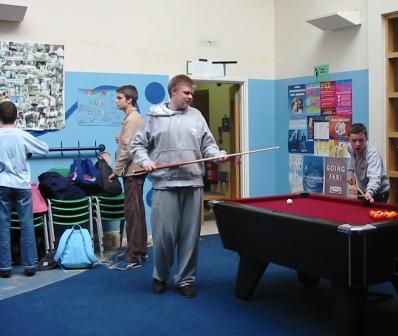
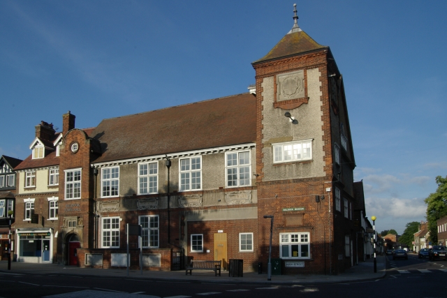
 Youth Club - In Baldock there isn't anywhere for teenagers to go, there is only parks and public spaces such as the high street and around Tesco. This intimidates other kids, and adults or the elderly, so having somewhere for them to go and hang out would be a good idea. we were thinking they could transform the Baldock Museum which is in the centre of Baldock to something with pool tables or air hockey and couches to make somewhere for any teenagers to hang out in. the Baldock museum is very rarely used and doesn't have much in it at all, so could have the facilities of a youth club, as well as the original stuff.


Scout hut - This isn't too run down, but it could potentially be re-furbished or re-painted to look better inside and outside. There could be some new equipment put in it, for the kids and for parties, this would attract more people

My group

We have got ourselves into groups in order to brainstorm and come up with some useful ideas for our campaign to rejuvenate some green spaces in Baldock.

In my group there is:


-Janvi Bhalla

-Megan Webster

-Megan Byford

-Georgina Paulus-Nield (Myself)
Campaign Poster Analysis No.3


This campaign poster is designed and produced by 'Transport for London' and the campaign 'Think!'. The young boy is lying down on a darkened road which has quite negative connotations. He has obviously only around the age of 17 or 18 which is a prominent clue to the target audience for this campaign. It is obviously targeting both young and older teens that live around busy roads and areas of that sort. Although the image shows a male, I don't think that gender restricts who this campaign is targeting as both males and females are open to these threats.

The colours used in this image have quite darkened and gloomy connotations. These colours consist of mostly greys and blues with no bright colours other than the text. The background that surrounds the boy seems to be some sort of inner city area which doesn't really look very happy, uplifting or safe. It shows some blurred out flats but is very vague and hard to make out which could reflect the accidents effects on the boys vision.

The most unnerving part of this poster is the fact that the very injured or even dead boy is looking directly into the camera and at the audience; a direct mode of address. This is often used in campaign posters or often adverts as it allows the campaign to have more of a personal and emotional effect on the public as it seems as though the image, or boy in this case, is communicating with the person looking at the poster. This will hopefully make them more likely to listen to the message being put across by the poster. The boys age also makes him seem more innocent and therefore the image is more emotive.

The first two lines of text use the largest font and so stand out the most. It is done very cleverly so that the first line uses a brighter white which contrasts with the background the most and is so the clearest. This links in with what the text is saying which is 'My friend saw the text'. This is the part he saw, but the second line of text is in a more dull white which blends in with the background more and links in with the message that this second line of text is saying which is 'He didn't see the truck'. This is very clever and is another way of getting the message across to 'Stop Think Live' which is the next line of text. This is used in many of the campaigns posters as there slogan and the main message they want to put across.

The logos for the 'Transport of London' and 'Think!' are also included at the bottom of the page so that the public know who is behind the campaign and also so that they know where to go to find out more information on the subject behind the poster.

Wednesday 9 October 2013


Campaign Poster Analysis No.2
This poster was created by the NHS, nation health service, in order to put off the public from continuing on smoking. Smoking is a very dangerous habit which is increasingly popular within older teens.

The poster has a very particular target audience which is to both young and old teens. This is obvious when we see a young girl, who looks about 17 or 18, being 'hooked' on cigarettes. The girls skin looks almost bruised and discoloured making her seem very weak and ill. This is an unattractive look and also unsettling for the public who are viewing which would have been the NHS's aim. Further more, she almost looks emotionless and drained of all her liveliness and happiness, showing the effects of being hooked on cigarettes. The girl has not been made to look beautiful or joyous because that would not fit the criteria of what the NHS 'smoke free' campaign wants.

The most striking thing about this campaign which really grasps your attention is the fishing hook that is pierced through the girls lip. This is a very unnerving image which almost sends a shiver through your spine as you glance at the image. You are able to see the exact point where the very sharp hook enters her lip which makes the link between the image and the smoking seem very punishing and cruel and thus, off putting to the audience.

There are no uplifting or vibrant colours used on the page because the whole idea being the 'smoke free' campaign is to make smoking seem like a very undesirable habit and make people stop as soon as possible and somehow get into a stage of realisation of how bad smoking is for them. The main house colours used are dark greens, blues and greys; all of which have no positive connotations.

The only text used on the page is the logo for the NHS and the campaign 'smoke free', and the 2 lines of text used to catch the readers attention and put across the hard hitting message. The first line states a distressing fact that 'the average smoker needs over five thousand cigarettes a year'. This seems almost unbelievable but really puts the habit of smoking into perspective for the audience reading the poster. Using the word 'average' means that the figure of '5 thousand' relates to every smoker in some way which is a very clever technique to use.

The second line of text uses a word link to the image on the poster. It says 'Get unhooked. Call 0800169 0 169 or visit getunhooked.co.uk'. The word 'unhooked' is repeated twice in this line of text making it the most prominent part of the poster as it relates to the girl having a fish hook attached to her lip. It gives quite a harsh idea of the issue of being hooked to smoking but this is want the campaign wants, and also what it needs. The use of 'shock' from the image is what makes this poster stick in the publics mind. The use of the word 'unhooked' also gives us more of an idea of what the target audience is as it is addressing the people who are already smokers, not those who are considering starting. Contact details of how to get help are also used in this line of text which will help people in the process of getting 'unhooked'.


Friday 4 October 2013


Conventions of a campaign

>Logos: Logos are small images or designs that are used as a symbol adopted by an organization to identify its products. Logos are import as they allow different areas of the campaign to be linked together such as billboard adverts, blogs and magazine adverts etc.

>Contact details: Contact details are used within campaigns because the public can use them to email in or write in to enquire about the campaign and it’s aims and also can get more information.

>House style: The house style of a campaign is where similar fonts, colours, designs, and language styles are used in each area of the campaign as this doesn’t create an overpowering amount of contrast so looks good, and the colours will be recognisable for the campaign it self.


>Slogan:
A slogan is similar to a logo in that it is put on each area of the campaign in order to make the reader be able to recognise the maker or brand that is behind the campaign. A slogan is
a short and striking or memorable phrase used in advertising.

>Name of company:
The name of the company is always used as it allows the public to be able to research more into the campaign itself and also into the company as a whole.

Media Task 1- Watch This Space

What are Campaigns?

: To work in an organized and active way toward a particular goal, typically a political or social one.

 There are many different types of campaigns but all of them contain a range of adverts of different Medias in order to publicize some sort of product, event or issue.
Here are some examples of methods of promotion:

-Small companies tend to promote things using many types of ‘advertising messages’, such as putting adverts in the yellow pages, a very well known telephone directory which most households will have possession of, or using the internet, television or radio to broadcast upcoming events that will help promote the company. They also use billboards and direct mail along with social media sites such as Facebook and Twitter to get in touch with different audiences and sections of the public. Small companies choose these simpler methods because they are effective but also within their budget.

-Promotional campaigns that can help entice and bring in customers include:

*coupons
*price reductions
*buy-one-get-one-free
*promotions
*contests
*loyalty programs

-Loyalty programs are designed to reward customers according to how much they have purchased. Even small businesses such as cafes use loyalty cards, in a way that if you for example buy 10 drinks on your loyalty card, you’ll get the 11th free. This is something that is attractive to customers and makes them continue to return to the café as they feel they are getting something out of it. Many companies follow a loyalty programme such as Tesco with their ‘Club card’ loyalty campaign. With such a large brand using this scheme, it shows how effective it is. It is a good way to spark some interest in a new business which is something
I should keep in mind when designing my campaign.

What is a community?


Baldock St. Mary's Church
A community is where are group of people who are based in the same place or area. Baldock has a community; they are the people that are homed there. I need to think about and consider communities because they are what my campaign is aiming to help. I need to help bring a local community together by rejuvenating ‘community spaces’.

One local community space in Baldock is the church, where lots of youth clubs and services are held. Cafes and restaurants are also useful places to have in a community as they allow socialisation between different people in the community. My aim is to turn a rundown area which is local to me, and turn it into something that will benefit the community.

Letchworth fountains
Why is regeneration important?
Regenerating local places are important because they keep a spirit of unity within the community and allow people to feel a part of something bigger. It gives people a sense of belonging.

We need to rejuvenate these places because we need more places where every person within the community can find a sense of homeliness and comfort… both for the old and the young, the strong and the weak, the loved and the unloved. Furthermore we need to understand that communities are just like families and that needs to be a constant reminder from the community spaces in our local area.

A local community campaign from the past is when the people of Letchworth campaigned to save the trees when the council decided to build a fountain in Letchworth town centre where the trees were. The community got together in order to achieve a goal that they all wanted. It brought the people involved together and even though it wasn’t successful, it still helped the community come together.

Campaign Poster Analysis

This campaign poster by ‘Drive Smart’ is a very effective poster in many ways. The first is that it uses both shock and guilt in order to catch the public’s attention. Other campaigns that have been know to use shock as a method in their campaign poster's is the 'DodgyCigs' campaign which was created to try and warn off drug dealers selling 'dodgy' cigarettes.
From research, it has been stated that adults aged 17 to 24 are the most vulnerable according to casualty figures.

The highly emotive image of ‘Jessica’ a very young child is used in the poster in order to bring out the emotions of the public and make them want to help the young girl. Her facial emotions are set in a distraught manor, showing how effected she is by her father’s death. She has tears streaming down her face which is something that will make the audience feel extremely guilty and sympathetic and will make the poster’s very hard hitting message to not speed, stick in their mind. Most of the colours on the poster are
quite dull and lifeless which makes a clear link to Jessica’s emotions and her father’s death, creating a very eerie effect on the public. The image uses an indirect mode of address and almost looks like she’s pleading someone to bring her father back.

The text used on the poster is very short, but at the same time gets the message across both effectively and emotively. It address’s the public as ‘you’ making them feel guilty as though they killed the girl themselves. They end the text with a rhetorical question ‘Was it worth it?’ which is  a well known persuasive technique which makes the public actually question what it would be like to be the person speeding. This will be a very disturbing thought and would definitely make them wary of speeding when driving. The smaller text at the bottom of the page says ‘Speeding costs lives. Slow down’. The ‘S’ sound at the beginning of both sentences is very harsh, making more of a foreboding and negative impact. It’s simple, but effective. There is only one bright and striking colour used on the poster which is for the campaign maker’s logo ‘Drive Smart’. They make this bold so that people know where to come for more information.