Thursday 20 February 2014
Leaflet idea 3 aimed at teenagers- Megan Webster
This leaflet is aimed at teenagers, our target audience, aged 13-16, it is a double sided leaflet that would be printed in A5. The leaflet is in a light blue colour on both sides as it is neutral and it will stand out to our target audience as it is bright and bold. We have used eye-catching fonts that have a “graffiti” feel to them, this is stereotypically ascociated with teenagers, and we feel it would appeal to them. We have used the same fonts and colour of the fonts throughout our campaign, both print productions and for our webpage, this will be easier for teenagers to recognise our campaign through different media platforms. On both sides of the leaflet we have added little doodles and graffiti like images. These will stand out and would attract our target audience. Some of the doodles give ideas as to what activities would take place at the youth club. We have included lots of pictures as teenagers would find it easier to visualise the campaign and get more of an idea from it, we have added backgrounds and borders around them to make them stand out more, the pictures are also all in colour. Teenagers might be put off by large amounts of writing on the posters and leaflets, they tend to find pictures more engaging to look at. We have made sure that our logo, campaign name and slogan are included across all our media platforms as it is important for our target audience and adults to see and be able to recognise them. They always appear in the same colours and fonts. We have added sub-headings above the text so teenagers could go straight to the bi they want to read, we feel that this layout will be easier to understand. There is a large section on the leaflet on how to get in contact with us, “Check us out”, we have included all the social networking links as teenagers tend to use social networking more, and we have also included our website, our target audience can use any of the links to find out more information about the campaign and can find out how to be more involved with it. We can attract lots of teenagers with our campaign as we don’t just use one social networking site. We included the logos of the sites next to links so it is very clear to read. The information on the leaflet gives you a brief but detailed summary about our campaign and what we aim to do in the future that will benefit our target audience greatly.
Leaflet idea 2- aimed at a general audience- Megan Webster
Front cover
Inside
Our second leaflet is aimed at a general audience but we have again chosen to use the light blue colour due to it being a fairly gender neutral colour and attractive to both sexes. There is a smaller amount of text on this poster as we are aiming the poster at everyone so we didn't want to have so much text that teenagers we out off reading it but we wanted enough text so that adults felt they fully understood the campaign. As on our previous leaflet our name 'Youth4Baldock' is repeated five times and both our slogan and logo are repeated twice and feature on the front cover and inside the leaflet. This all encourages brand identity and ensures that whenever someone see's any form of our media adverting they connect the name with our campaign, it also keeps a consistency within our advertising. We have also included our contact information so the public can contact us with any questions or to volunteer.
Sunday 16 February 2014
Leaflet idea 1- Janvi Bhalla
Front
Inside
Back
Inside
Back
This leaflet is aimed at parents of teenagers because we want to appeal to them as well as our target audience of teenagers as they can encourage their children to participate in the regeneration and then attend the youth club, but they can also help with the regeneration as they will know its benefiting their children. We have used a light blue background because it's a neutral colour and isn't a bright neon colour like the green we have used on the posters because that may put off adults. We have created a house style running through the poster by only using two fonts that are both clear to read and link to logo. For the text we have used 'Arial' because we felt it was easy to read and looked very professional and unlike on the posters where we have gone for a more childlike handwriting font due to them aiming at teenagers we wanted a more age appropriate font. The other font was the one we used for our name which is 'EDO'. We chose this font because we thought it looked the most attractive due to having a 'graffiti' style effect which is more appealing and stereotypical to teenagers. As this leaflet is aimed at parents we have a large amount of text and only a few images because we know that adults will not be out off by large amounts of reading and will want to fully understand the campaign in more detail than teenagers might. We have repeated our logo twice on the leaflet to encourage brand identity and also have our repeated twice to ensure the readers know what we want to achieve and what our campaign group stands for; our name 'Youth4Baldock' is also repeated five times throughout the leaflet. Finally on the fold out page (back) we have included all of our contact information and listed our social media sites where people can get in touch with us to find out more about the campaign or volunteer. In today's society most teenagers are on Twitter and Facebook but so are many adults so we felt it would be beneficial to have accounts on these websites as well as having our own website and giving a phone number to give readers numerous ways of contacting us.
Saturday 15 February 2014
Our TV Advert- Group
We created a short documentary style film that we want to be shown in local cinemas that will get people in the local area involved with the regeneration of Baldock Museum.
https://www.youtube.com/watch?v=89gZEF0uFjk
Our social networking links
https://www.facebook.com/baldockregeneration?ref=ts&fref=ts
https://twitter.com/Youth4Baldock
Friday 14 February 2014
Our website
1. HOME PAGE - Megan Webster
2. IDEAS/BLOG PAGE/WE NEED YOU/ PLANS FOR IT- Georgina Paulus-Nield
3. GALLERY -Janvi Bhalla
4. LINKS/CONTACT PAGE- Janvi Bhalla
Our website is in this design because it looks very creative and would appeal to our target audience. Without looking messy, it has a simple and clear design, but still has a graffiti and artistic layout. We felt this artistic layout was appropriate. because our target audience would find it appealing to the eye for them. However, as well as being a good look for teenagers, this design is also clear to parents, the links at the side are clear and the information is detailed and relevant to our campaign. The images used are all of Baldock museum and of relevant activities and pictures, such as a snooker table and a creative paint pot set. This will put emphasis on where the campaign is taking place, and what we plan for the teens that come to the club. The only other picture is our logo, which we though was important to have somewhere on the website, as it is the most recognizable thing about our campaign.
Poster 1- Target audience teenagers- Georgina Paulus-Nield
This poster is aimed at our target audience of teenagers aged 13-16 and we designed it by adding features that we thought would be attractive to them. We put in a light green background as we know that green is a very gender neutral color and the brightness of the green makes it more attractive to the target audience as it is more striking and eye catching. The green also links to our logo and we did this so that we could have a distinct house style running throughout the poster. Our fonts also add to the house style as we only used two. For the title and the subheadings we used 'Kristen ITC' as we thought that this was a very clear font but because it is a slightly child like/ handwriting style font which we thought would attract teenagers more. The font we used for the title and sub-titles is 'EDO' and we thought it was the most attractive because it has a 'graffiti' style effect which is more appealing and stereo-typical to teenagers. We have also included lots of images and a more than we included on the poster aimed at the parents of teenagers because we know that younger peoples fine images more interesting as they tend to spark their imaginations and give them a more realistic view on the campaign than plain text. We also added doodles around certain areas of the poster as this gives it more of a scrapbook and stylish effect which is very attractive. In our text we used elements of informal language such as 'hang out' and 'check us out'. We did this because we thought that the teenagers would be able to relate to it more and furthermore would find it more interesting. We also added our logo and slogan because we wanted these to be present on all of our advertising media formats as that the public can recognise it and link it to our campaign. Another feature we added was the links to our social networking sites and website. The reason we did this was because teenagers stereo-typically use facebook and twitter a lot so we thought that it would be a good idea to put it on all our media formats.
Poster 2- Target audience teenagers- Georgina Paulus-Nield
Thursday 13 February 2014
Poster 3- Aimed at adults/parents- Megan Byford
This poster was aimed at the general audience, mainly for adults, so it is still attractive to the older generation when read. It hasn't got much writing which makes it attractive to the youth club's target audience as teenagers prefer looking at pictures than they do reading too much information. Although, there is a good amount of complex language and information on the posters for any parents or adults to look at, which is why this poster has been made to suit mainly the audience of parents, but also involves teenagers. The colour green is very neutral and not stereotypical to either gender, it is also not very loud, make it easier on the eye for an older generation. Green also symbolises safety, growth and freshness, all of which our regeneration wants to prove. The text style is very cartoony, almost script like, this is because it would appeal to the younger generation and let everyone else know who we're doing this for. We use this instead of bulk standard 'times new roman' style texts. Our name, logo and slogan are all near the top and enlarged, so people know exactly who we are and what we are doing and here for. There are a range of different images from the museum, which just shows the location and the necessity of change. Using stars and a graffiti style arrow shows that we are here for young people instead of adults, stars also give the connotation of a brighter place and 'reaching for the stars' which is something we would encourage at the youth club.
Images we're going to use on our campaign media
This image is a close up of the slightly worn down and unattractive sign that is supposed to inform potential visitors to the museum, about the museums opening times. The dull and lifeless green against the old brick doesn't exactly portray the museum as one that is worth visiting which is why we are going to include it in our print and digital media as we want to encourage the regeneration.
This picture of the museum is very unappealing to anyone that looks at it. We made sure to take it on a rainy and dull day as the grey skies add to the overall poor appearance of the museum.
Local places that could be regenerated for the community
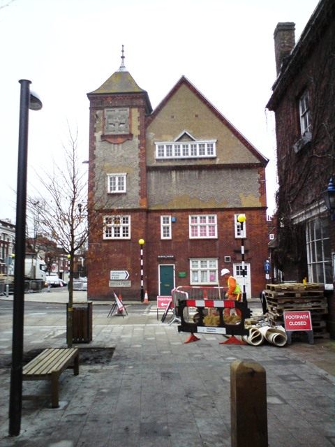
-The Baldock town hall is a place that definitely needs regenerating and in the past there have been campaigns to do so. For years it has been neglected and unused and it is time to do something about it. Both the interior and exterior are completely uninspiring and unattractive.
-Another place in Baldock is the scout hut which is in use by the community but is very unattractive and would definitely benefit from being regenerated.
-
-The Baldock museum could definitely use some help from our regeneration team, which is why we've decided to dedicate our time to do so!
-Another place in Baldock is the scout hut which is in use by the community but is very unattractive and would definitely benefit from being regenerated.
-
-The Baldock museum could definitely use some help from our regeneration team, which is why we've decided to dedicate our time to do so!
Area's around our school that have been regenerated
In our school there was an underused area by the staff car park so the student council took it upon themselves to put a chicken pen there with lots of chickens for the other students to look after. This has been a great success as it has taught some of the younger kids how to look after things and the meaning of responsibility.
Another area that has been regenerated around our school is round the back of the technology block at the back of the school. Before, there was an area of unused land with weeds and various things growing in it; it was completely uncared for. The student council decided to do something about it and so now the area is a place where students can grow different plants and things in the ground.
Photos of local places that ARE community spaces
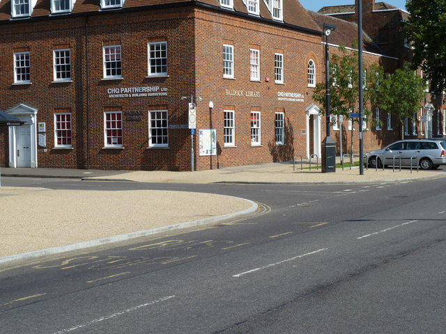
Baldock Library:
Baldock Community Centre:
Ashwell Rec:
This community space is used frequently and not just by the younger generations using the place equipment and taking part in 'Ashwell Academicals' football club, but also the slightly older generations taking part in Sunday morning cricket practice and matches in the summer. Events are also often held here such as Ashwell sports day.
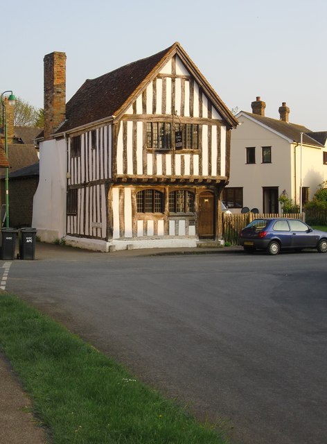
Ashwell Museum:
The Ashwell museum is full of old parts of Ashwell's past in which many members of the community often visit for enjoyment and for trips by Ashwell school for educational purposes.
The Rose and Crown pub:
Pubs are always a way for the families and friends of the communities to come together.
George VII pub:
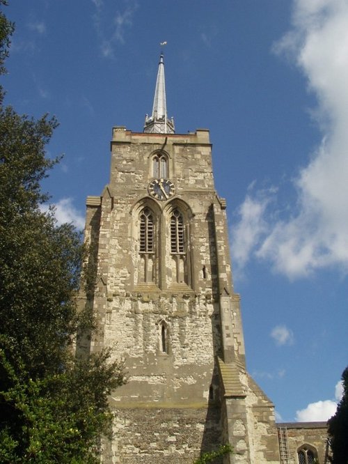
Baldock Church:
Services are often held here that bring the religious members of the community together.
Ashwell Church:
Ashwell Tennis Courts:
Existing Community Campaigns (mostly local)/ Analyses
Surviving Winter is a campaign made in Hertfordshire in order to help the communities elder generation 'survive winter'. The aim is for people in the community to donate in order to help the elderly stay warm over winter. Fuel prices are rising as are many other prices so it is important that the community got involved and donated from their website. They also have a Facebook page where the public can easily ask questions and interact with others that are involved as well as receiving regular updates on upcoming events. The logo is a scarf wrapped around the shape of the heart. This is a very emotive image which will hopefully encourage people to donate. The red color of the scarf links to the idea behind the heart and furthermore has connotations of love which would hopefully further persuade the public to donate. The target audience would have been anyone between the ages of 13-50 year olds and families who may have family members in the same situation and so want to help the community. To gain awareness there were no defined methods of promotion other than the website as it is not a national campaign, but it is extremely likely that leaflets would have been delivered to the homes of the people in Hertfordshire with information about links to their website and what they want to achieve.
This community campaign was made with the intentions of encouraging local volunteers to promote and look after special areas for wildlife in Stevenage. These include community ponds across the Stevenage, as well as Monks and Whomerley Woods and Shackledell Grassland in Fairlands Valley Park.They encourage volenteers to do activities such as sponsored runs in order to gain interest and raise money for the campaign so that they can achieve more and make more of a difference. They want to take care of Stevenage's environment and keep it in good condition with beautiful scenery.
The campaign ended in 2013 but in its time managed to open up woodland rides (paths which let light in) in Monks and Whomerley Woods allowed the return of stunning early purple orchids to the woodland in the spring of 2013. There were no specific methods of print promotions such as poster, but it is likely that leaflets would have been posted to people's houses all around Hertfordshire as they would have wanted as many people involved as possible.
Their logo of a claw really draws attention to the 'Wild' in the name of the campaign 'Wild Stevenage'. Its simplicity is really effective and it puts across the campaigns message clearly.
This campaign really did make a difference and i'd say that the target audience is quite broad, ranging from families to anyone has cares about the community or is interested in the environment.
Save Baldock Town Campaign
This campaign was publicised by the Comet because the town hall has been empty for the last two years so various organisations and people in the community held a meeting at the Baldock community centre in order to raise awareness of the buildings status and to furthermore, do something about it. The meeting had a very positive outcome in that lots of people, especially the young, wanted to get involved although it is thought that over £50,000 of repairs will need to be put in place. Some of the younger people considered turning the hall into a music venue for bands to play in, so when the campaign begins to develop it's methods of promotion I think it's focus area of the public should be 15-24 year olds as this would probably attract them the most. They were given from September 2011 till March the following year to come up with a viable business plan that would benefit Baldock's community. The campaign and plans are still in progress and are not finished as of yet and so there are no main posters used for the campaign. In addiction, it is likely that fliers of leaflets will have been given to people and delivered to their houses. Chris Gomm, a member of Baldock Town Ltd said that at the meeting, "Many people had not realised the poor condition the building was left it" and that they are "very encouraged by the meeting". These statements will hopefully motivate more people to get involved so that the plans can be put in to action.
The 'Green gym' Campaign
This campaign is made up volunteers who offer their help to hundreds of thousands of people each year to reclaim and regenerate local green places. Through their own environmental projects and through their network of 2,000 community groups around different areas of the UK, they help communities take responsibility for their own local environment that may not be living its full potential.
Their logo is made up of blues and greens and looks really simple but effective. The green is a very gender neutral color and also reflects the color of trees and our environment. This will attract quite a wide audience but from the picture we can see that most of the volunteers are around middle aged and are those who are interested in the environment. The campaign wants to get as many volunteers and donations as possible and that their need to help rebuild neighborhoods and green spaces is the most important thing for them. The blue is a very pure color which reflects the campaign's need to purify those green parts of the environment that have been neglected.
On their website it very clear what the organisation is about and it is very easy to donate and/or become a volunteer. Furthermore, they have some very emotive and true stories of how becoming a volunteer has changed some peoples lives. Their website has a very attractive design and at the top it features their slogan "Reclaiming green spaces since 1959". A slogan is quite rare on a community campaign but the language is very straight forwards and informative and it benefits the campaign as that will be able to be recognised on all forms of advertising media they might choose to use. At the moment the background of the website is some leaves dusted with frost which cleverly links to our current cold weather in winter/spring. This will alert the public that the website is regularly updated and is current as the background changes every season and they will therefore be likely to enroll as a volunteer.
The campaign has different groups of volunteers all over the country and each one focuses on a certain community. It is very simple for you to find the nearest group to you on the website.
This community campaign was made with the intentions of encouraging local volunteers to promote and look after special areas for wildlife in Stevenage. These include community ponds across the Stevenage, as well as Monks and Whomerley Woods and Shackledell Grassland in Fairlands Valley Park.They encourage volenteers to do activities such as sponsored runs in order to gain interest and raise money for the campaign so that they can achieve more and make more of a difference. They want to take care of Stevenage's environment and keep it in good condition with beautiful scenery.
The campaign ended in 2013 but in its time managed to open up woodland rides (paths which let light in) in Monks and Whomerley Woods allowed the return of stunning early purple orchids to the woodland in the spring of 2013. There were no specific methods of print promotions such as poster, but it is likely that leaflets would have been posted to people's houses all around Hertfordshire as they would have wanted as many people involved as possible.
Their logo of a claw really draws attention to the 'Wild' in the name of the campaign 'Wild Stevenage'. Its simplicity is really effective and it puts across the campaigns message clearly.
This campaign really did make a difference and i'd say that the target audience is quite broad, ranging from families to anyone has cares about the community or is interested in the environment.
Save Baldock Town Campaign
This campaign was publicised by the Comet because the town hall has been empty for the last two years so various organisations and people in the community held a meeting at the Baldock community centre in order to raise awareness of the buildings status and to furthermore, do something about it. The meeting had a very positive outcome in that lots of people, especially the young, wanted to get involved although it is thought that over £50,000 of repairs will need to be put in place. Some of the younger people considered turning the hall into a music venue for bands to play in, so when the campaign begins to develop it's methods of promotion I think it's focus area of the public should be 15-24 year olds as this would probably attract them the most. They were given from September 2011 till March the following year to come up with a viable business plan that would benefit Baldock's community. The campaign and plans are still in progress and are not finished as of yet and so there are no main posters used for the campaign. In addiction, it is likely that fliers of leaflets will have been given to people and delivered to their houses. Chris Gomm, a member of Baldock Town Ltd said that at the meeting, "Many people had not realised the poor condition the building was left it" and that they are "very encouraged by the meeting". These statements will hopefully motivate more people to get involved so that the plans can be put in to action.
The 'Green gym' Campaign
This campaign is made up volunteers who offer their help to hundreds of thousands of people each year to reclaim and regenerate local green places. Through their own environmental projects and through their network of 2,000 community groups around different areas of the UK, they help communities take responsibility for their own local environment that may not be living its full potential.
Their logo is made up of blues and greens and looks really simple but effective. The green is a very gender neutral color and also reflects the color of trees and our environment. This will attract quite a wide audience but from the picture we can see that most of the volunteers are around middle aged and are those who are interested in the environment. The campaign wants to get as many volunteers and donations as possible and that their need to help rebuild neighborhoods and green spaces is the most important thing for them. The blue is a very pure color which reflects the campaign's need to purify those green parts of the environment that have been neglected.
On their website it very clear what the organisation is about and it is very easy to donate and/or become a volunteer. Furthermore, they have some very emotive and true stories of how becoming a volunteer has changed some peoples lives. Their website has a very attractive design and at the top it features their slogan "Reclaiming green spaces since 1959". A slogan is quite rare on a community campaign but the language is very straight forwards and informative and it benefits the campaign as that will be able to be recognised on all forms of advertising media they might choose to use. At the moment the background of the website is some leaves dusted with frost which cleverly links to our current cold weather in winter/spring. This will alert the public that the website is regularly updated and is current as the background changes every season and they will therefore be likely to enroll as a volunteer.
The campaign has different groups of volunteers all over the country and each one focuses on a certain community. It is very simple for you to find the nearest group to you on the website.
Campaign analysis of a Drug Campaign (Individual)
Frank
This campaign poster is for a drug campaign called 'Frank'. Frank is a drug advice website which tries to educate (mainly) young people about different drugs and their effects. The website has lots of information about all the different drugs there are and also allows you to not only share your stories if you've had a drug problem which could help others, but also offers help to those in need if they have something like a drug addiction. You can call, text, live chat or email Frank and all the language on the website is very welcoming such as 'Need some friendly confidential advice?'. The rhetorical question is very comforting and non-pressurising and the use of the word 'friendly' will reassure the person needing help that everything is okay and that no one is judging them. This poster is a perfect example of how they do that and spark interest in young people.
Apart from the blue in the cats smile the only colors used are black and white. These colors are very basic which is why the smile of the cat stands out on the poster so much. The cats smile is very similar to the 'disappearing cats' smile in 'Alice in Wonderland'. This film/story is a very well known children's film so the younger generations such as teenager who are the posters target audience, will immediately be drawn to the poster. The poster now has their attention but the text says 'Does Meow Meow have whiskers'. This sentence could have one of two effects. Firstly the teenagers could not understand it so therefore want to know what it's talking about. The rhetorical question doesn't give away much to the teenagers who don't know what 'Meow Meow' is which is why they would want to know more as they would want to know the answer to the question.
On the other hand, the teenagers who do know that 'Meow Meow' is in fact a drug will see the link to their childhood film and find the image quite unsettling. The innocence of childhood and the stories that come with it (such as Alice in Wonderland) highly contrast to the idea of illegal drugs like 'Meow Meow'. They will therefore want to know more about the drug and so will hopefully visit the 'Ask Frank' website where lots of information is provided about the different effects of different drugs.
At the bottom of the page in smaller text is information about how to get their website and why they should visit it: 'If you have any questions about drugs'. Their campaign name 'Frank' is also featured at the bottom where it is in it's common font style which looks quite graphical, again linking to the appeals of their target audience.
Frank also has used more online formats of media in their campaign. They have a Facebook page and Twitter page which were recently launched to further reach out to the teenagers of our society who are commonly associated with using social networking sites.
Frank also has a YouTube account where videos are regular posted with information about drugs in order to raise the teenager's awareness of their affects. A YouTube is a very effective way of gaining interest from teenagers as they are constantly using the site for music and inspiration for their lives. Furthermore, lots of them even have their own accounts.
Campaign Analysis for Public safety campaign- (Individual)
Analysis of "Public safety and Justice" Campaign
This campaign was used to create awareness of public safety. They are a national campaign who aim to 'end profiteering from the incarceration of people.' They use public policy, education, and grassroots organising to stop the expansion of 'prison privatization' and to shut down existing private prison facilities. They have a website which explains their aims.
Their logo which is shown in the image above is a very well designed logo. It features their name and I really like the colors used. The green is a very gender neutral color which allows them to target both genders as it is appealing to both. They also use both dark and light greens which add depth to the image and make it more interesting and eye catching. Furthermore they have used an image of a tree which highlights the idea of community and the public. Also, the branches could also reflect the idea of a family tree and how in reality, we are all connected in some way. This would help people feel more of a connection to the campaign and furthermore want to get involved more to protect the safety of their community and the public.
There are two objects hanging off the tree branches which almost look like scales, but they are unbalanced. This gives the audience an impression that something needs to be done about public safety and justice and that if they got involved, then maybe the scales could be equal. The blues used in part of the poster work really well as blue is a very pure and innocent color and has been used to reflect these qualities in the public. The idea of innocence may also bring up the image of our children and how their safety could be at risk.
This campaign also uses social media to target the public and get them involved in the campaign. They have a Facebook site:
This site has regular updates on their thoughts on whats going on and reports that they've done on Americas safety status. Furthermore they also talk about events that are coming up so the public can easily get involved if they want to. We know that a lot of people use Facebook although stereo typically the younger generations such as teenagers. This would give us the impression that they want to get as many people involved as possible to help their campaign.
They also use a website as another method of promotion. The website also has regular updates and furthermore has details as to how you can get involved and has parts for you to fill out. It is all displayed very clearly for the public so they fell more inclined to get involved as there is no hassle involved. The website features their logo and has a very bold title at the top which will catch the public's attention and they will know exactly what the campaign is about. They will also be able to notice the logo on any other forms of media and link it to the campaign.
Sunday 9 February 2014
Analysis of Campaigns- Political (Individual)
Barack Obama's Campaign for President 2008
This is the 'hope' poster used to advertise and draw attention to Barack Obama's campaign to be president. As you can see the red white and blue colors used on the poster are all colors that feature on the USA's flag. This gives the poster an almost communal feel which would have been intentional because his job as president will be to try and bring the country together.
This image was created and distributed on posters and other media forms and different words were used instead of hope, such as 'progress' and 'change'. All these words are very simple but at the same time state Obama's aims in a clear way. The words also link to the expression on Obama's face as his eyes are almost looking into the distant future and both his mouth and eyes convey the idea that he is ready to lead America into a better future and that he believes in his plans to do so. Obama is also wearing a suit which makes him look very professional and more like a leader than a normal individual.
The logo used on the poster looks almost like a badge and shows a circle, with the center suggesting a sun rising over fields in the colors of the American flag. The colors used on the logo also link to the American flag like the rest of the poster. This repeats the house colors throughout the poster and gives it a distinct house style. Another aspect of the poster that adds to the house style is the style and presentation of the poster. It has a very modern feel to t which is because it almost looks a stylized 'graffiti' image. This is because it was made but a graffitist. This makes the poster more quirky and original and it makes it stand out more which is probably why it was so popular.
Contact online
Obama wanted to contact the younger generations like 19-28 year olds by visiting social networking websites such as Facebook and Myspace which they 'stereo typically' use a lot. The reason he thought that this was important was because he knew that people of these ages don't tend to vote because they don't feel like politicians actually listen to their problems. Obama received a really positive reaction from Americas youths after trying to build trust and gain their interest in his thoughts for their futures. He built an upfront, personable and face-to-face quality that gave his supporters a sense of security and trust, which inspired them to rally others in their local communities. This had a knock on effect in that more and more people wanted to get involved.
Websites were made in honor of Obama's campaign to be president to try and gain more supporters. Some of these websites included his 'fight the smears' website which was made to 'counter' what the campaign described as 'smears' made by Obama's opponents. This helped him campaign as it meant that the public were kept updated on what Obama's views were on current situations.
Logo and slogan
Obama's logo shows shows a circle, with the center suggesting a sun rising over fields in the colors of the American flag. The image of a sun rising over a horizon gives the idea of a new day and a new future and it almost conveys a certain feeling of hope.
The slogan "Change we can believe in" uses the word 'we' to highlight the feeling of community and the fact that Obama wants to bring people together and get everyone involved. The word 'believe' gives the idea of hope for a better future which is something that will really appeal to the public.
Other
Obama did speeches all around and America in order to make his opinion and his plans for Americas future heard. Seeing someone in person doing a speech rather than a planned advertisement or picture really reflects Obama's humanity and allowed the public to see the 'true' Obama.
There were other forms of media advertisement other than just posters, such as tv advertisements. These were used to reach out to people of all ages and to try and get everyone supporting him campaign.
In the end he was elected as the first black presidnet in 2008 so all his campaigning did pay off.
Subscribe to:
Posts (Atom)